Typography
Master Typography with Creative Brand Land
Ready to elevate your brand image and boost conversions?
Unlock the power of typography!
Creative Brand Land dives deep into the anatomy of type, from tracking and kerning to leading and swashes. Learn how to master these elements and craft a cohesive brand voice that resonates with your audience. We'll guide you through selecting the perfect fonts, including main fonts, decorative fonts, and display fonts, to build a comprehensive brand book that establishes a strong and lasting impression. Stop settling for mediocre typography. Start building a brand that speaks for itself.
Typography
The team at Creative Brand Land understands the importance of Typography. Using the correct typeface in specific circumstances will strengthen your message and instantly grab the attention of your audience. Choosing the right typeface(s) for your Brand will increase the effectiveness of your message, create a unique Brand image and instantly convey a mood or feeling to your demographics.
This Typography section briefly outlines several key features that are essential when choosing fonts for your brand identity. We understand how these key features apply to Internet Marketing, how they can aid with the click-through rate, improve navigation, and strengthen funnel analytics.
Selecting typeface(s) that enhance your message is an essential component in building Brands. Typography is an important aspect of creating a unique identity that is instantly recognizable through every point of contact with the customers and potential customers.
We work with our clients to determine what your objectives are; attention-grabbing headlines, readable, legible, copy length, engaging your audience, and/or increasing the click-through rate. Does the typeface need to perform in print, web, streaming videos, tutorials, commercials, billboards, conferences, or other media? An expert eye can select a typeface that resonates with your Brand's demographics and cater to your Brand's objectives.
Our team can guide you in the selection of a Serif Font, San Serif Font, Display Font, and/or a Signature Font as an intricate part of your brand identity.
Points
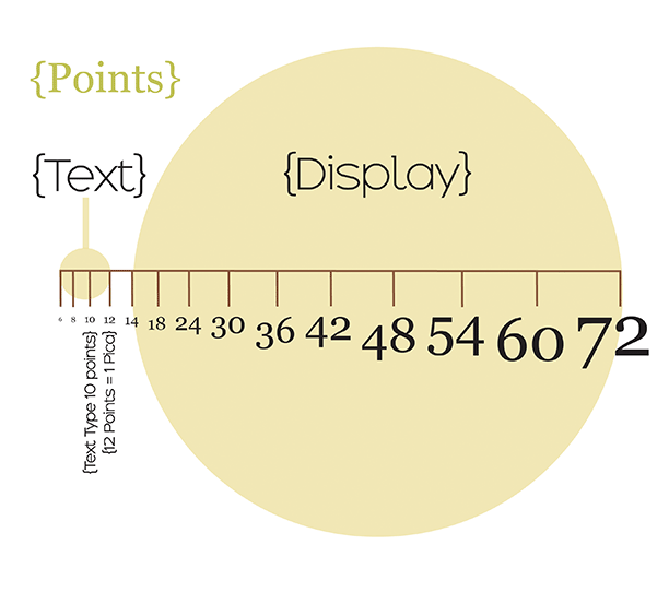
Points are a typographical unit of measurement in the print industry. When compared to the inch as a unit of measurement, a Point is approximately 1/72 of an inch. 12 points are equal to 1 pica or 1p. The abbreviation for a Point is pt.
The point is a unit of measurement to describe the font size. It describes the height of a typeface character. Text type is between 6-12 Points and display Points are larger than 14 Points. Display Points are used for Headers, Headlines, and Bold statements. Points are used to also describe leading, kerning, and tracking.
Conversion
1 inch = 72 Points
1 inch = 6 Picas
1 Pica = 12 Points
½ inch = 3 Picas (3p)
¼ inch = 1 Pica, 6 Points (1p6)
pica
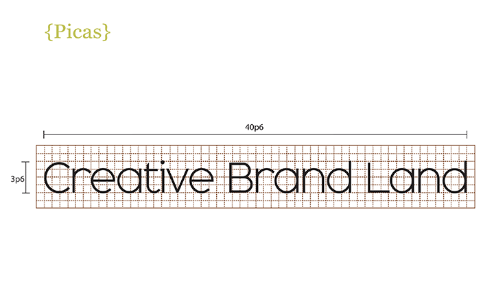
Understanding measurements and how they apply to print and digital marketing is the foundation of Typography strategies. A Pica is a typographical unit of measurement in the print industry.
When compared to the inch as a unit of measurement, a pica is approximately 1/6 of an inch. 1 Pica is further divided into 12 points. The abbreviation for a Pica is p and depicted as 6p. 12 points equal 1 pica or 1p. Half a pica is 6 points or 0p6.
Picas are used in the layout of newspapers, magazines, and advertisement campaigns. They are used when measuring columns and margins and used to measure spacing, leading, and type.
Kerning
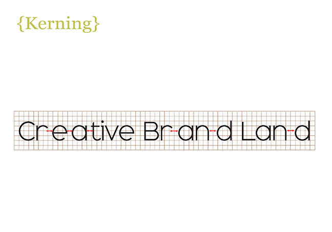
Kerning is the space between letters. Subtle adjustments in kerning can help with spacing, especially between letters with angles like W, V, and A. This example of too much kerning illustrates how disproportionate spacing can affect readability. The larger the text, the more noticeable the spacing can appear imbalanced. With an expert Typographer, subtle adjustments in kerning can improve readability, especially in Headlines, Titles, and Logos.
Many free fonts can have kerning issues. It is best to purchase professional fonts with expertly rendered kerning and balanced stroke weights that improve both readability and legibility.
Creative Brand Land uses professional fonts in our Font Library to ensure proper spacing and balanced stroke weights regardless of size.
Tracking
Tracking is similar to Kerning, where Tracking is the space between all letters. The difference between Tracking and Kerning: Tracking is the space between all letter vs. kerning is the space between two letters.
Leading
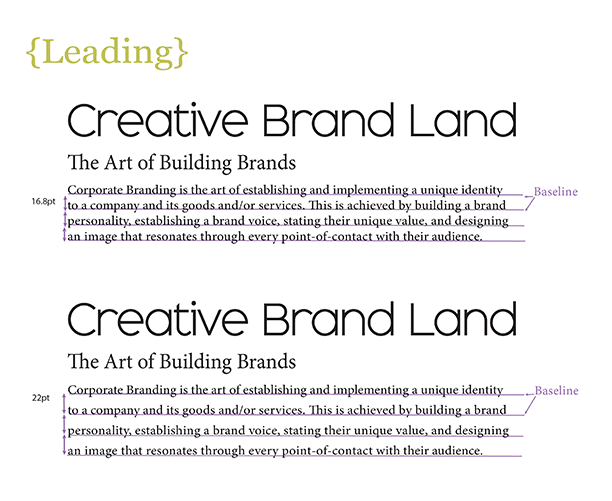
Leading is the vertical space between the lines of text. The distance is measured between the two baselines. The term Leading originates from a time when typesetters manually used a piece of lead to insert space between lines. Correctly applying Leading will improve readability and Legibility. Our team knows how much Leading should be applied in different circumstances like headlines, headers, copy, newspaper columns or print advertisements. Correctly applying Leading will improve readability and Legibility.
It is important when choosing a Typeface suitcase to understand the purpose of the font.
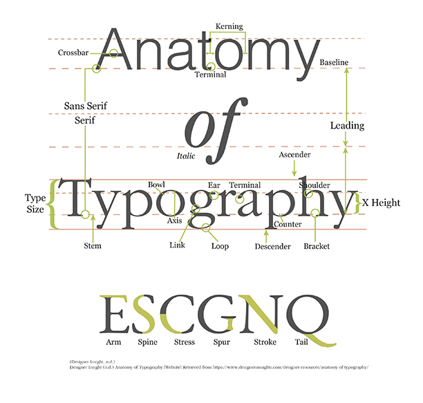
Anatomy of Typography
Axis is the imaginary line that divides a character and bisects the curved angle of a stroke.
Arm is a horizontal stroke that attaches to a font on one end.
Ascender is the portion of a font that is above the x-height.
Crossbar is a horizontal stroke in letters like A, H, f, e, etc.
Bowl is a curved part of a character that creates an encircled space
Bracket is a wedge-like shape that connects the small strokes in serif fonts with the main font character.
Counter is the empty space within a bowl
Descender is the portion of a font that is below the x-height.
Ear is a small stroke off the top of a g.
Kerning is the space between letters.
Leading is the space between lines of text that are measured from baseline to baseline
Link is the stroke that connects the top and bottom of a character that contains bowls and/or loops.
Loop is the lower portion of a g.
Serif is the small stroke that extends from the main front character
San Serif does not contain the small strokes that extend from the main front character.
Shoulder is the curved stroke aiming downward from the stem in h,m,n.
Stem is the main vertical stroke in a character
Terminal the end of a stroke that does not end in a serif.
x-height is the distance from the baseline to mean line in a small x determines the height.
(Strizver, n.d.).
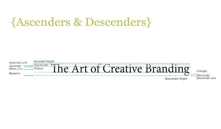
Ascender & Descender
An Ascender is the portion of a letter that extends above the mean line to the Ascender Line. A Descender is the portion of a letter that extends from the Baseline to the Descender Line. The x-height is the main portion of the letter between the Baseline and the Mean Line. The Ascenders and Descenders have a direct effect on recognizability. Fonts designed to be readable at smaller sizes may have larger Ascenders and Descenders to increase legibility, whereas fonts designed for larger points sizes may have decreased Ascenders and Descenders to avoid looking awkward.
The x-height is literally the height of a lowercase x. It is the distance between the Baseline and the Mean Line.
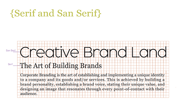
Serif and San Serif
The difference between Serif and San Serif is simple. Serifs have additional stokes whereas San Serifs are without the additional feature making the Font appear bold. Generally, Serif fonts are used in the body of text because of their readability at a smaller size. San Serif fonts are excellent for Headers, Titles, and Banners because of their bold strokes.
A well-planned design should include a San Serif for all headers and titles, a Serif for all body text, and a unique, eye-catching Display text to be used sparingly as a highlight throughout all point-of-contact within the brand's audience. This will further create a unique identity for the Corporate Brand.
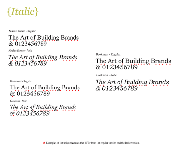
Italic
An Italic typeface is a cursive font based on classic handwriting. The Italic typeface is on an angle slightly slanted to the right. True Italic Typefaces are not just slanted versions of the upright font but are designed from scratch with distinctive qualities that are not in the upright version. The examples shown indicate the distinctive qualities that differ from the regular typeface and the Italic version of the typeface.
Oblique
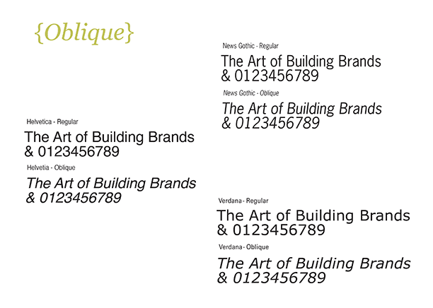
The Oblique typeface is slanted to the right. They are less decorative and lack the fancy curves and stylized ascenders and descenders. Although Oblique typefaces may look like a slanted version of the upright counterpart, upon closer look, there are slight differences. Proportions and thick and thin qualities may be slightly adjusted to enhance this simpler design in relation to italics. Obliques are sometimes described as less calligraphic versions of Italics.
Cursive
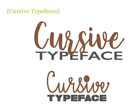
Cursive is a style of handwriting where the characters flow together. The pen is not lifted between letters resulting in quicker writing. Cursive typefaces appear as handwritten. The axis or angle can vary from upright to slightly slanted. These typefaces are especially useful similar to decorative typefaces, like headlines or headers. They set the mood, create aesthetics to the design, reflect a point of view, grab attention, state a message, and add to Brand recognition. These fonts should be used sparingly and limited to headlines and messages.
Decorative Typeface
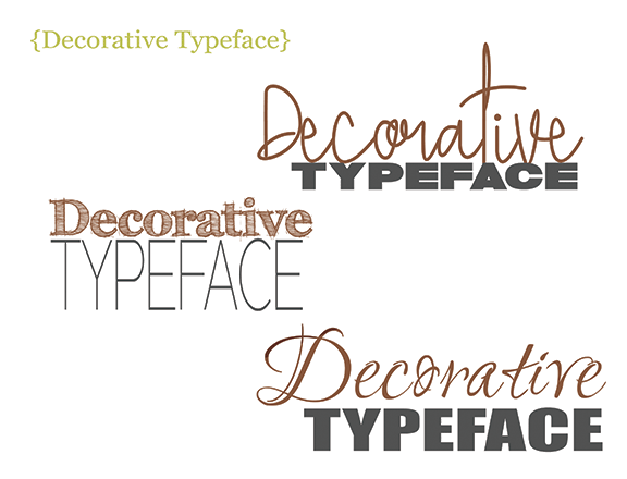
Decorative fonts have exaggerated features like swashes, strokes, ascenders, descenders, bold, ultra-thin, cursive, script, serif, san serif, italic, and a seemingly endless combination of styles, weight, shapes, and decorative elements. Decorative Fonts are generally used as headlines or headers. They set the mood, create aesthetics to the design, reflect a point of view, grab attention, state a message, and add to Brand recognition. These fonts should be used sparingly and limited to headlines and messages. They can be difficult to read. Often these fonts require larger leading because of the exaggerated ascenders and descenders. Decorative fonts tend to display exaggerated Kerning problems because of the nature of their designs. Too much of a gap can appear as a mistake and distract from the message. Our team can ensure proper leading and kerning when decorative fonts are used.

Display Typeface
The display typeface is a font that is used for headers and headlines. These typefaces are created to attract attention when used purposefully.
Many times, display typefaces can be used to create a distinctive personality as part of a brand image. They can evoke a mood or feeling and add a design aesthetic to the brand.
There are many display typefaces available to choose from; San Serif, Handwriting, Script, Chisel, Retro or Vintage, Brush Script, Grunge, Decorative, and a variety of unusual typefaces.
When choosing a display typeface, both readability and size are important features to keep in mind. Knowing the size range especially if the typeface will be used for web, print, and signs.
Demographics should be considered when selecting a display font. Choosing a large, bold San serif typeface for children would be very different from a stylized, energetic, mood-evoking typeface for millennials.
Swashes, Glyphs & Special Characters
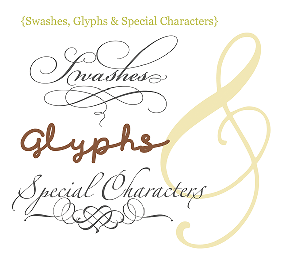
Swash characters have exaggerated flourishes on tails and glyphs. They tend to appear as exaggerated serifs. Swashes most commonly have embellishments at the beginning of a word and the end of a word. Swashes can be found in many script typefaces. The flourish features in swashes make them ideal for headers, headlines, logos, marketing material, and advertisements.
A Glyph is a symbolic figure or character that has meaning regardless of language. As an example, the ‘&’ sign or the letter ‘g’ are both glyphs. The letter lower case ‘i’ without the dot is still understood as an ‘I’ and still retains its meaning. Whereas the dot alone is not understood. A glyph is a character or symbol that has meaning.
Special Characters are non-alphabet and non-numeric glyphs. An example of these special characters are; @, #, $, %, &, *. When setting passwords, many companies are asking in addition to 8-12 letters, 1 capital, 1 number, and 1 special character.
Special characters such as ‘@’ or “&’ are ideal glyphs to convey a message or add a design aesthetic to a message. As a design element, these glyphs have a strong meaning and can grab attention.
Readability and Legibility
Readability is the way the glyphs are arranged to allow the eye to easily glide across the copy for quick recognition of words. Serif fonts are usually reserved for large passages or the body of the text to improve readability at smaller sizes. It is especially important to keep in mind readability when choosing decorative typefaces for larger point sizes.
Legibility is the ability to easily recognize the glyphs and their meanings. The ability to distinguish one character from another. A trained professional can design with these subtleties to further improve your corporate brand.
Creative Brand Land
Where Creativity Brings Brands to Life®
With the availability of so many web fonts, it is easier than ever before to choose decorative typefaces. As the selection of typefaces expands across devices and platforms to include a variety of tablets and cell phones, it has opened the way to create a unique brand identity through the availability of Digital Marketing Fonts
These typefaces can be scalable, can condense into columns, and reshape for smaller devices. They can be programmed according to a device through the CSS (Cascading Style Sheets).
Choosing the right Digital Marketing typeface(s) for your Brand will increase the effectiveness of your message, create a unique Brand image and instantly convey a mood or feeling to your demographics.
We work with our clients to determine what your objectives are; attention-grabbing headlines, readability, legibility, copy length, engaging your audience, and/or increasing the click-through rate. Does the typeface need to perform in web, streaming videos, tutorials, Internet Marketing Campaigns, or other media? An expert eye can select a typeface that resonates with your Brand's demographics and cater to your Brand's objectives.
Ready to take your business to the next level?
Top of page
Mission Statement
The art of bringing brands to life - start to finish. ™
Sign up for Marketing Tips, How to's, Inspiration and more
For more information contact Christine Solazzi at info@ChristineSolazzi.com
Address; Hobe Sound, Florida 33455